Tuesday, September 29, 2009

*Condition Apply- How many people understand this?

BAD DESIGN CONTEST, MY SUBMISSION #5 for UMO 2009


Advertisers attract people by creating an attractive advertisements and offers to grab the attention and sell their products. But often gets attracted by the advertisements and always get diverted to other track without reading the small invisible (*Conditions apply) which will be in the bottom which is almost unreadable font.

Most of the people don’t understand what is this (*) means and what would the conditions apply mean.  This is a he problem where always people are always confused and no idea what it really mean until they speak to customer care or read the instructions if any.

USB Ports in the computer is always confusing.

BAD DESIGN CONTEST, MY SUBMISSION #5 for UMO 2009

Always USB ports are big pain points to connect with the desktop or laptops. No idea which side to pin the USB in. Always need to try couple of times to plug it in a correct direction. Most of the time USB ill be in the CPU but CPU can placed any where like below the table, under the table self, self, locked cabin, on the table, etc. It is difficult to connect the USB reaching the CPU most of the times in these cases so it would much better to have a USB connection in the monitor as it is very easily accessible and upfront.

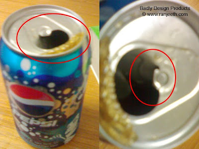
Soft drinks & Beer can lid design is sometimes dangerous and persons need to bend their head to the top along with the can to get the last drops out.

BAD DESIGN CONTEST, MY SUBMISSION #4 for UMO 2009


Design Problem: Beer cans and Soft drink cans are design in way that once you pull the lid handles outer direction, the knob pushes down a specific area and get opened. Most of the times the handle gets break as it’s a light weight metal and the corners are sharp enough to cut the upper lip areas.

 The other problem is that this design is very difficult to satisfy the use case when there is only some amount of liquid in it. The person needs to bend their head and the can totally up then only all the last drops come out of the can.

NO INDICATION WHERE TO TARGET THE JACK UNDER THE CAR AND LIFT THE JACK TO MAKE THE PUNTURE

BAD DESIGN CONTEST, MY SUBMISSION #3 for UMO 2009

Indian roads most often tyres get punctured. Each car has a different placement to target the jack and lift the car. Some cars can be targeted to the side steel rod below the door and for some cars it should be targeted to the tyre rods or just beside the connecting rod. There is no indication or mark below the car where the jack has to be targeted to? This is always a big pain to try different options to point and target the jack and lift the car.

BUS FOOT BOARDS ARE ALWAYS DANGEROUS. DRIVER CANNOT SEE EVERYTHING FROM A SMALL MIRROR.

BAD DESIGN CONTEST, MY SUBMISSION #2 for UMO 2009


In India most of the people use public transport. The Busses will be traveled full most of times people will be hanging on the Bus foot boards. Especially when it comes to the front foot boards it is very dangerous as the type is very next to his leg and he may be pulled into the type if his dress or get slip from the foot board. This is a very bad design as there should be grill or something which might avoid the person to fall into the type.

Always Indian bus stops are always full and crowded with lots of people. IT is very dangerous as the led can easily go into the type or the driver can start the bus and move forward on the peoples legs as he doesn’t have entire visibility from a small mirror.  Most of the time drivers find difficulties in the bus stops.  There should be a grill or something which helps to prevent go under the tyre.

IS CAMERAS NOT DESIGNED FOR LEFT HANDERS? HOW A LEFT HANDER WILL USE?


BAD DESIGN CONTEST, MY SUBMISSION #1 for UMO 2009
IS CAMERAS NOT DESIGNED FOR LEFT HANDERS? HOW A LEFT HANDER WILL USE?

Cameras are designed for the right hander and the click will be in the right and the camera to be holed by the right hand. Cameras predominantly have the hand grip, shutter release, film wind lever and commonly used selection buttons, switches and dials controlled by the right hand, lens controls (where present) tend to be accessible by either hand. When a left-handed person uses a right-handed camera the hand control can be less steady and hence produce camera shake leading to poorer pictures at low shutter speeds.

When cameras were predominantly mechanical or later electro mechanical, it would be difficult and hence expensive to produce a left-handed version of a right-handed camera. Video-cameras also tend to have the hand strap on the right side of the camera. Thus the camera must be held using the right hand, which often leads to a shakeier video being captured.

Sunday, September 6, 2009

AIR INDIA “USER IN EXPERIENCE” Design


Air India online ticket booking experience...nothing worse than this...
Recently, I was looking for fight prices to Bangkok and found Indian Airlines flies from Hyderabad - bangkok from yatra.com

Once i clicked the URL www.inianairlines.in it displayed Air India logos and site branding. Then i thought may be these two companies have merged now. Rechecked the URL but still it showed me www.indianairlines.in. There are 3 sections and each section has button just like a drop down design.

No idea where to click as there is any description. The 3 options are Air India Express, Air India AI Code flights.. (No Idea what this mean).. Air India IC code flights.. (No Idea what this mean.) Tried sometime and it looks like Air India Express is something different service and it has different fleets. Could not flight out difference between AI & IC codes... as there of the links take me to a different websites in a new windows and all of them has its own booking engines.

Ok, finally I thought lets try IC and find out flights for Bangkok.
Here is my booking experience...@ AirIndia .. :)


- The heading says. Book a flight - IC flights... (No idea....What is IC?)
- Multi city link... what it means..? Why is this placed after return...? No idea..!
- More cities link was placed after the cities. I was expecting this might open a other drop down in place and list more cities... but surprisingly it has taken me to other website.. :) We will find similar booking engine and it has few more cities added in the list and again you find a "more cities" link which will open the previous website "IC" in one more window :) What a great workflow..!
- I have selected Hyderabad - Bangkok and selected "Return" radio button and selected dates as Departure: 6 Sept 2009, and Return: 31September 2009. I was looking for the search button and did not find. By mistake I thought "Reset" Button is search and clicked on it. All the fields were reset to current date. I was confused because the reset button was given more priority than the “Book:” by placing this in right. Retyped everything and this time carefully looked into the user interface and realized I need to click on "Book Now" for searching...flights. - Once clicking the "Book Now" button it showed me the same screen, then I clicked 2-3 times but still in the same page. Looked carefully and noticed that there is an error in red color saying "Invalid Departure/Return Date" I thought that there might be no flights available on that day but the fact is that there is no 31st date in September. System doesn’t validate and tell the user about dates being a booking engine. Very sad and bad user experience…ever experienced…!
-By Default Indian Rupees is selected and id don't know why they want Any other currency radio button and a Drop down deactivated - selecting "Australia - AUD" Looks like the designer want to make the interface very busy without any room :)
-Instructions text is very funny; it occupies ~20% real estate and unwanted secondary information.

- All fares are reflected in Indian Rupees.
- Equivalent approximate fares in your chosen currency are also displayed.
- Sale of International Sectors (Ex-India or Return)is now available on our website.


Finally this website has eaten my time and I have decided that let me go back to some private fight booking website and do the booking. I have lost all the good will / credibility about this Air India spending some minutes on their website. I came to a conclusion that if something goes wrong in my shopping cart, I am not sure getting my money back easily...
Tried calling some local agents... at the end of the day :) as I felt they will respond me if I call them and intimate me the status rather than I solely taking risk :)

Summary: For online ticket booking site, search and the booking engine is the heart of the user experience. Too much of information will kill the experience, keep the site as simple as possible and design it more task driven. Have proper validation and give an impression that this site is secured and your money will be safe / secure. Divide the tasks in to primary and secondary and make it simpler to use by providing proper user assistance elements inbuilt in the design. This website needs a serious redesign and need to follow UCD model. Don’t know why Government is putting lot of money in other stuff but why they are not focusing on small things which give revenue to the government and happily diverting the business to the private folks!

my photostream

ranZeethT - View my flickr photo stream